← Works
O-DE INC.
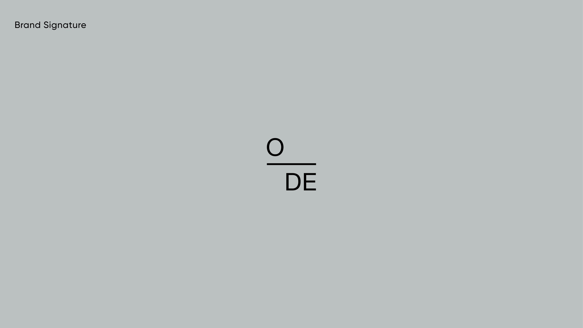
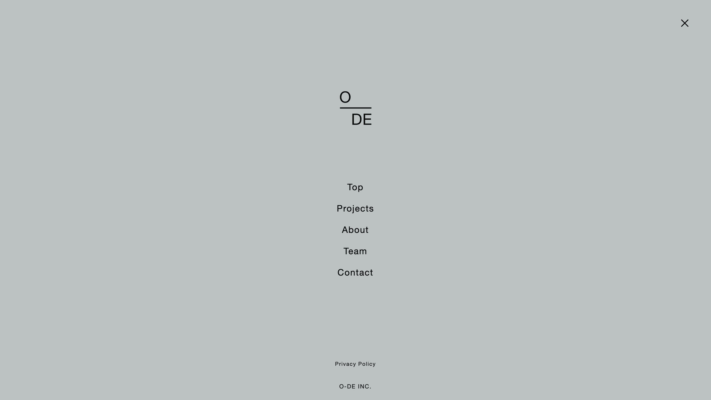
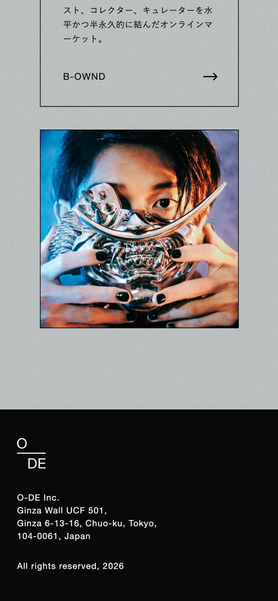
A logo built as a fraction, where one line carries the whole structure of the studio.
- Client
- O-DE INC.
- Services
- Art Direction, Logo Design, Web Design
- Industry
- Creative / Business
- Year
- 2021
- Website
- o-de.design ↗
About the project
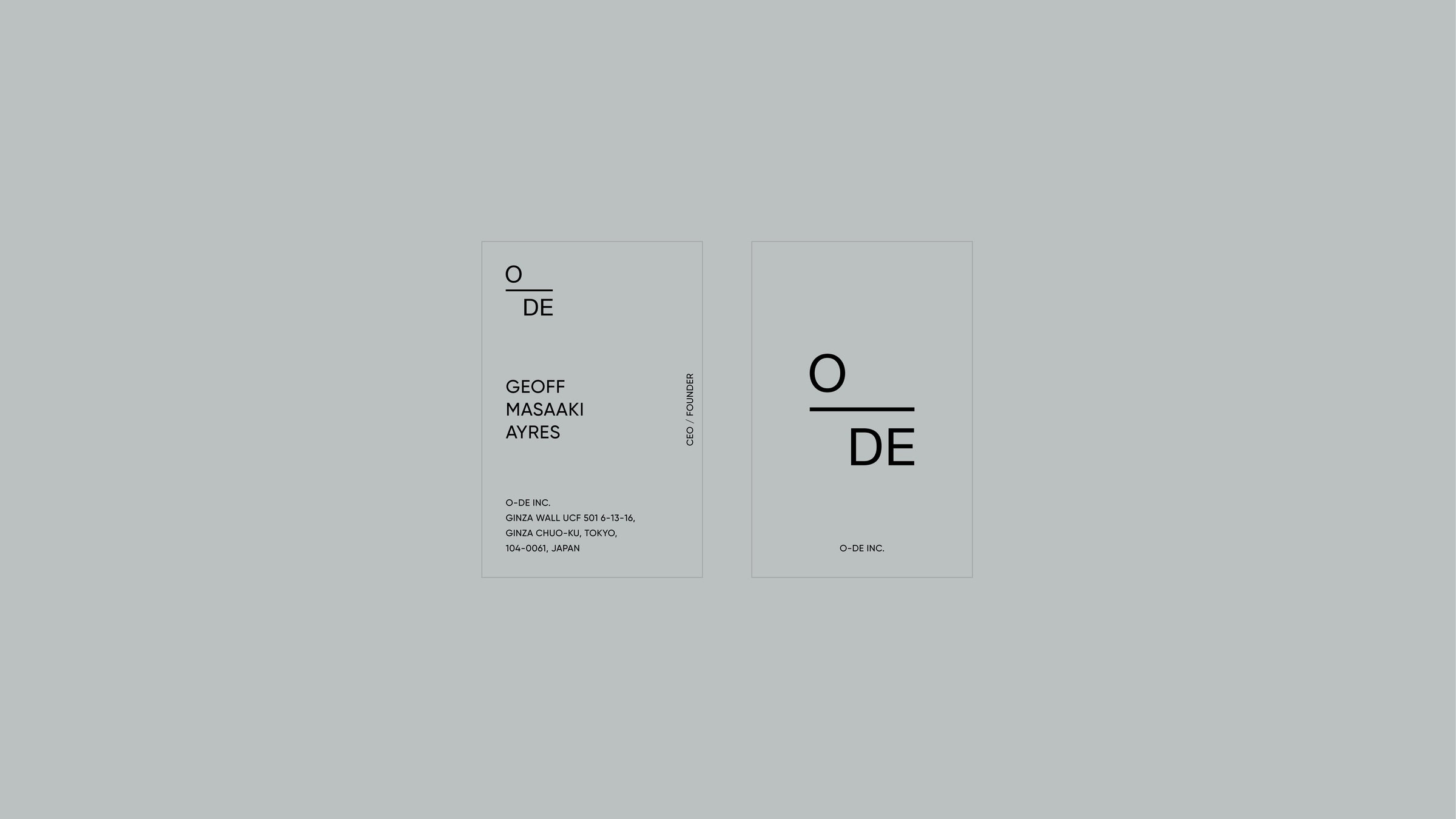
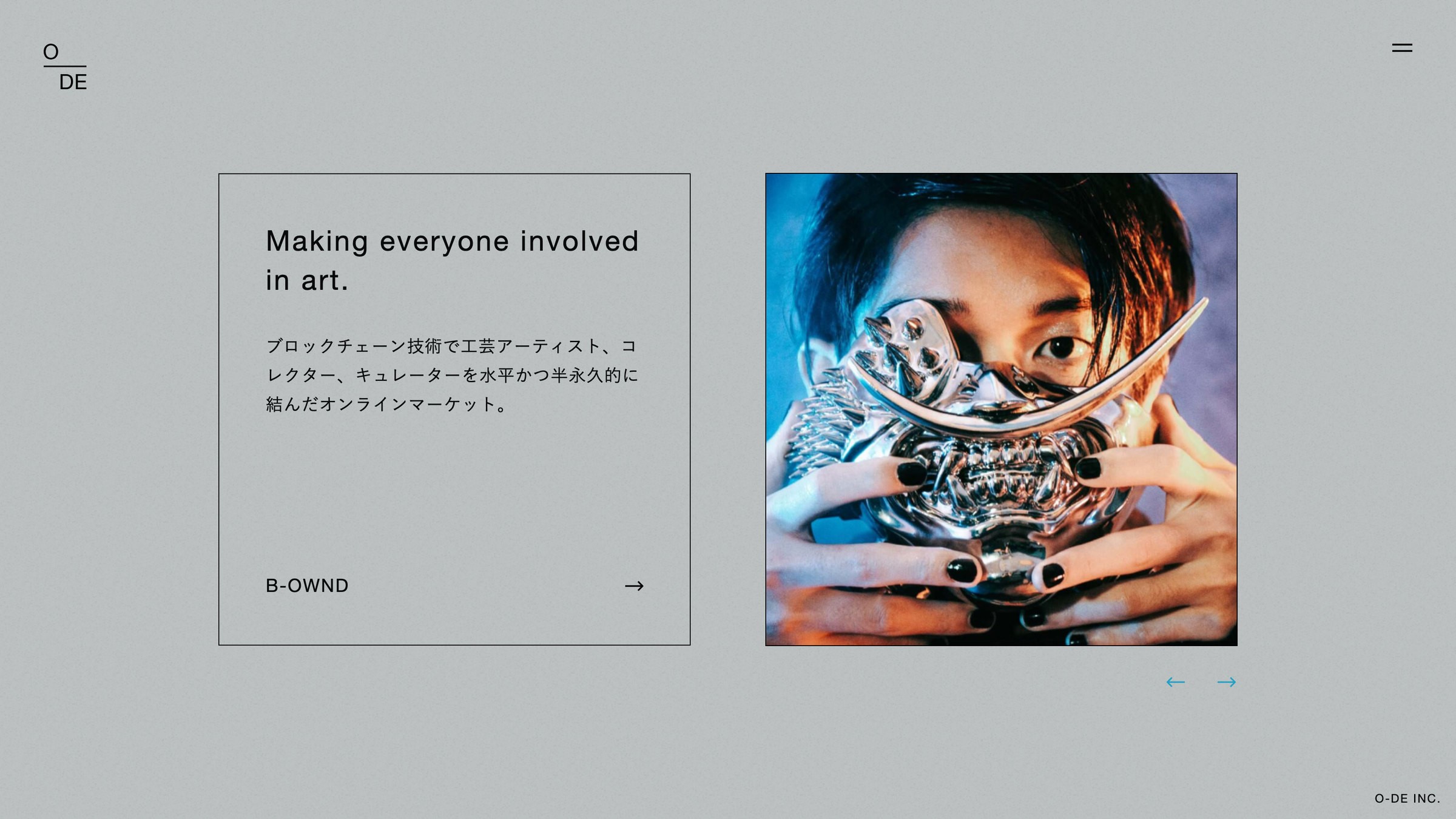
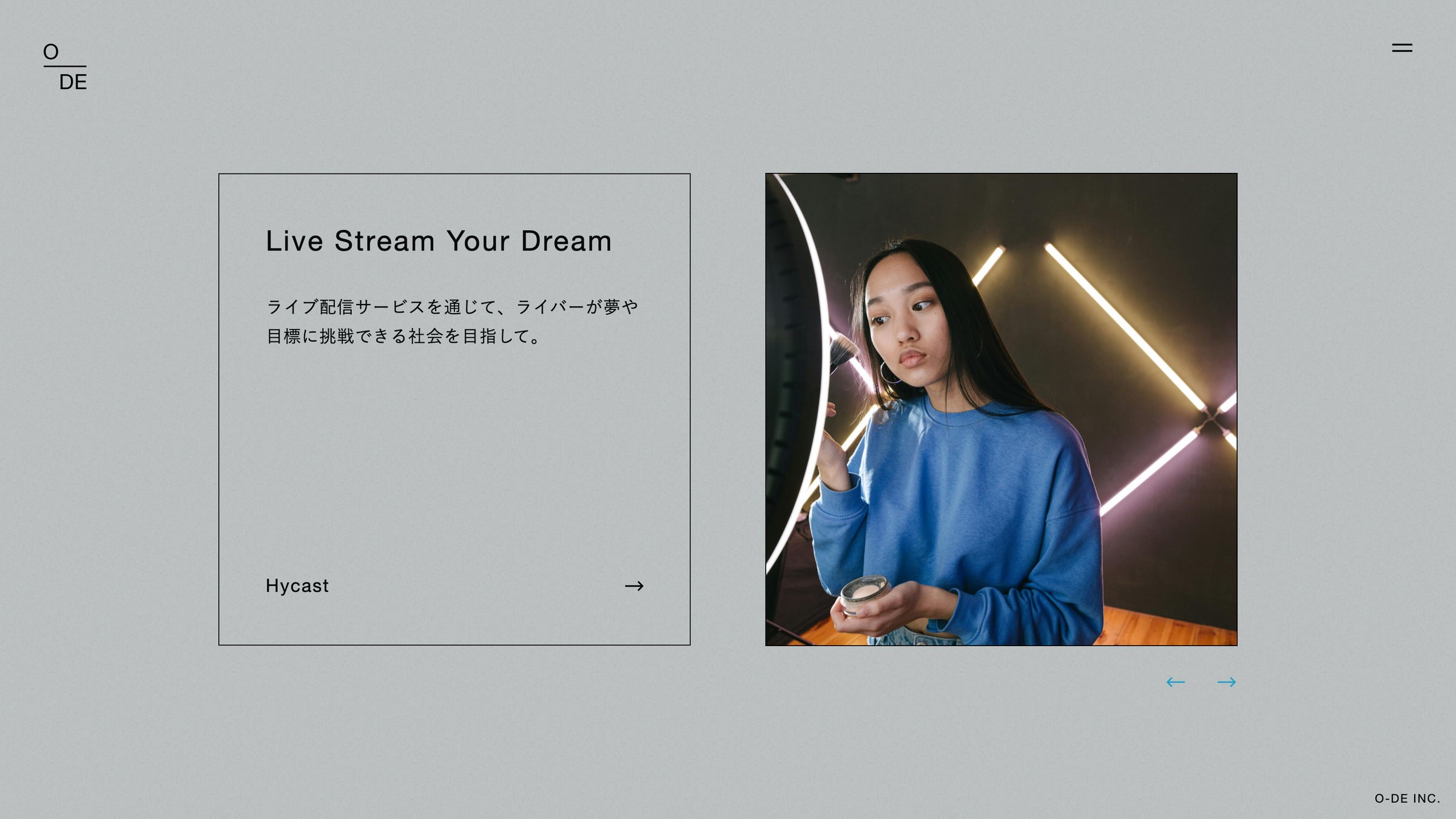
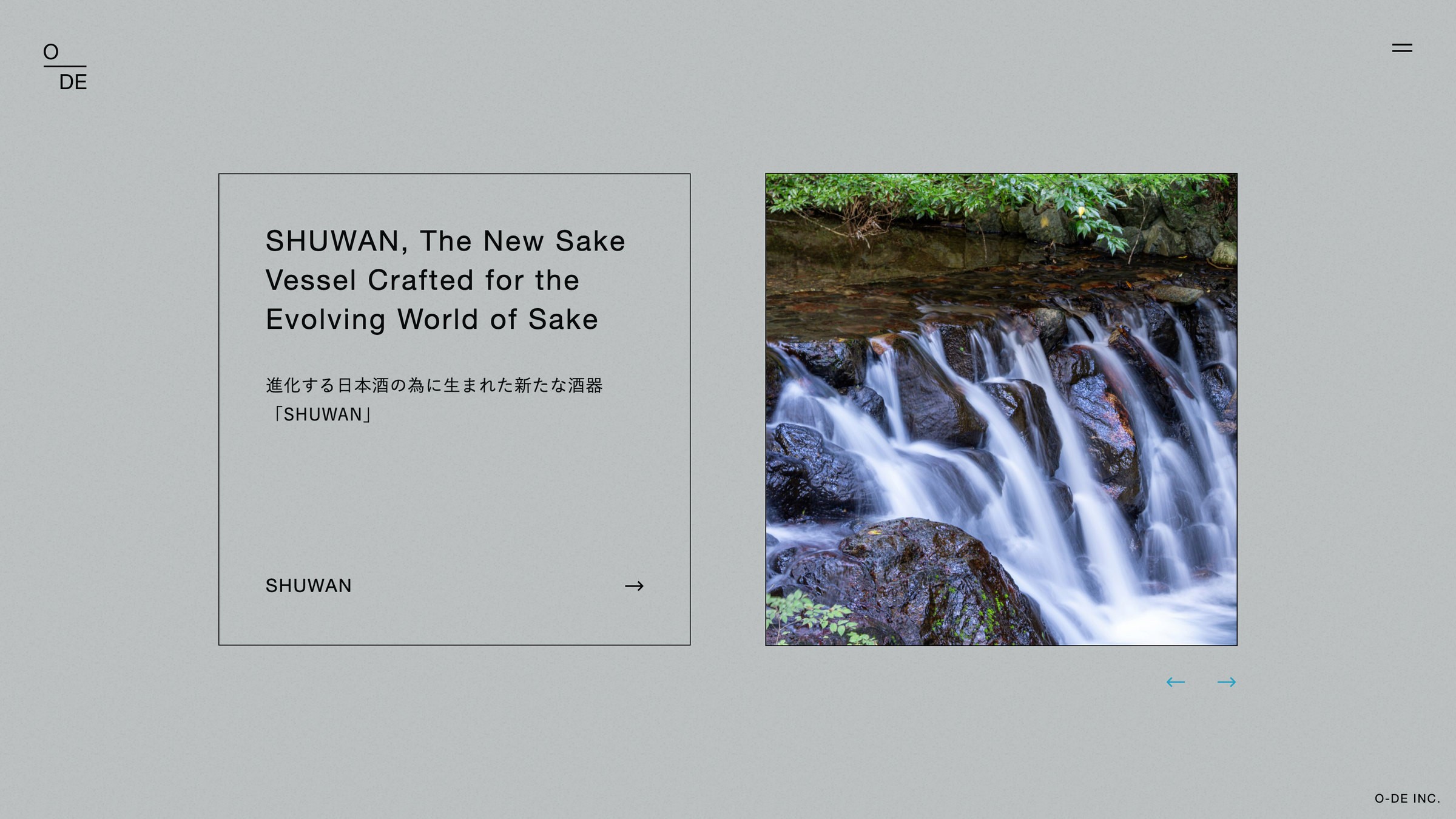
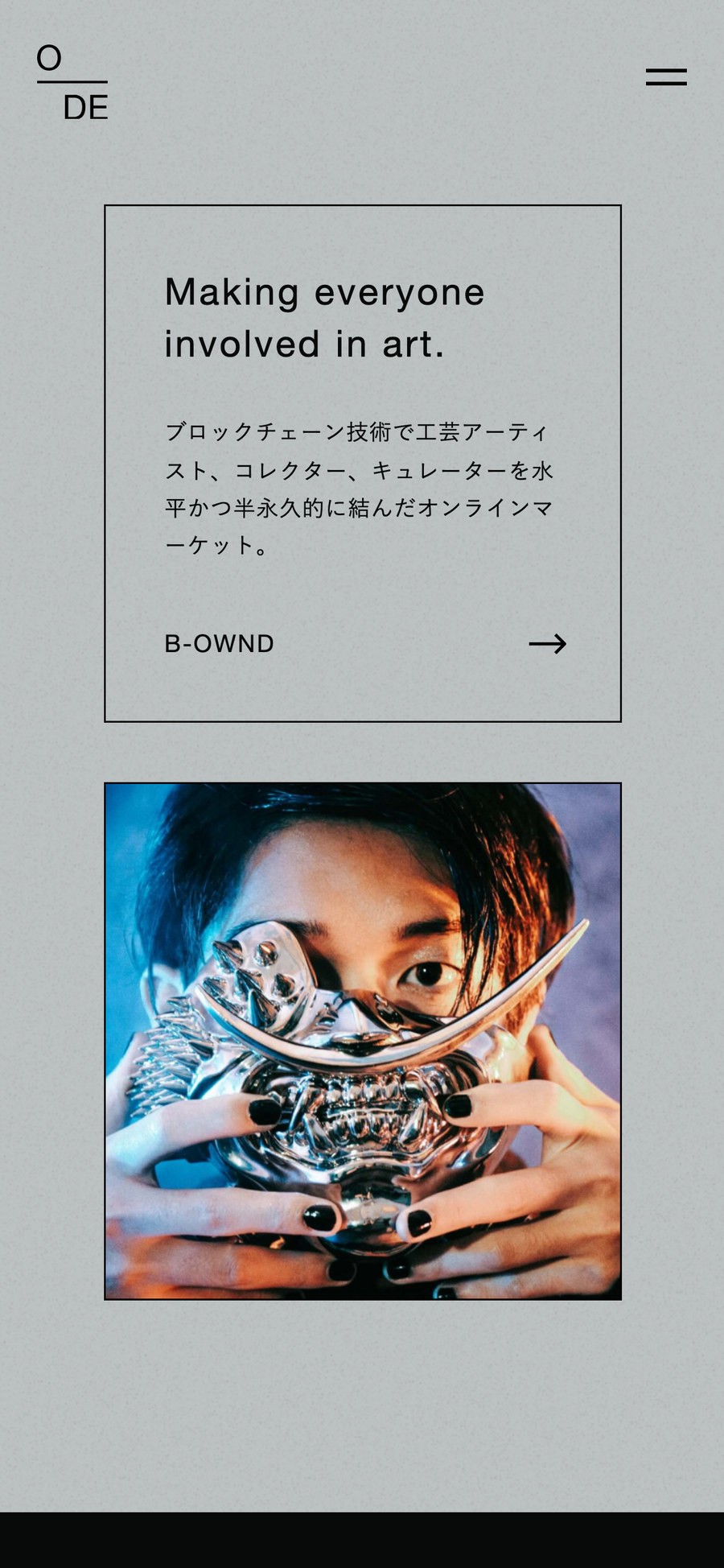
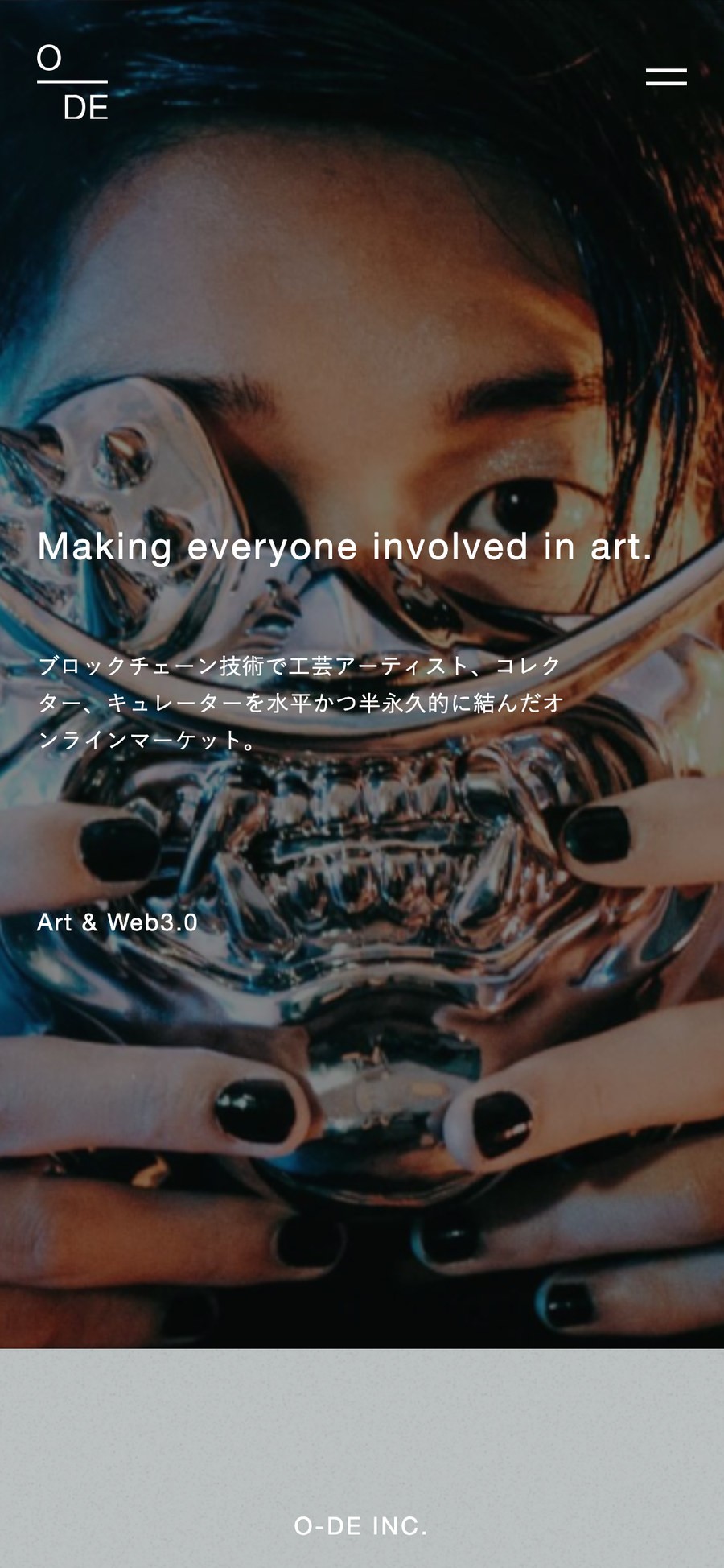
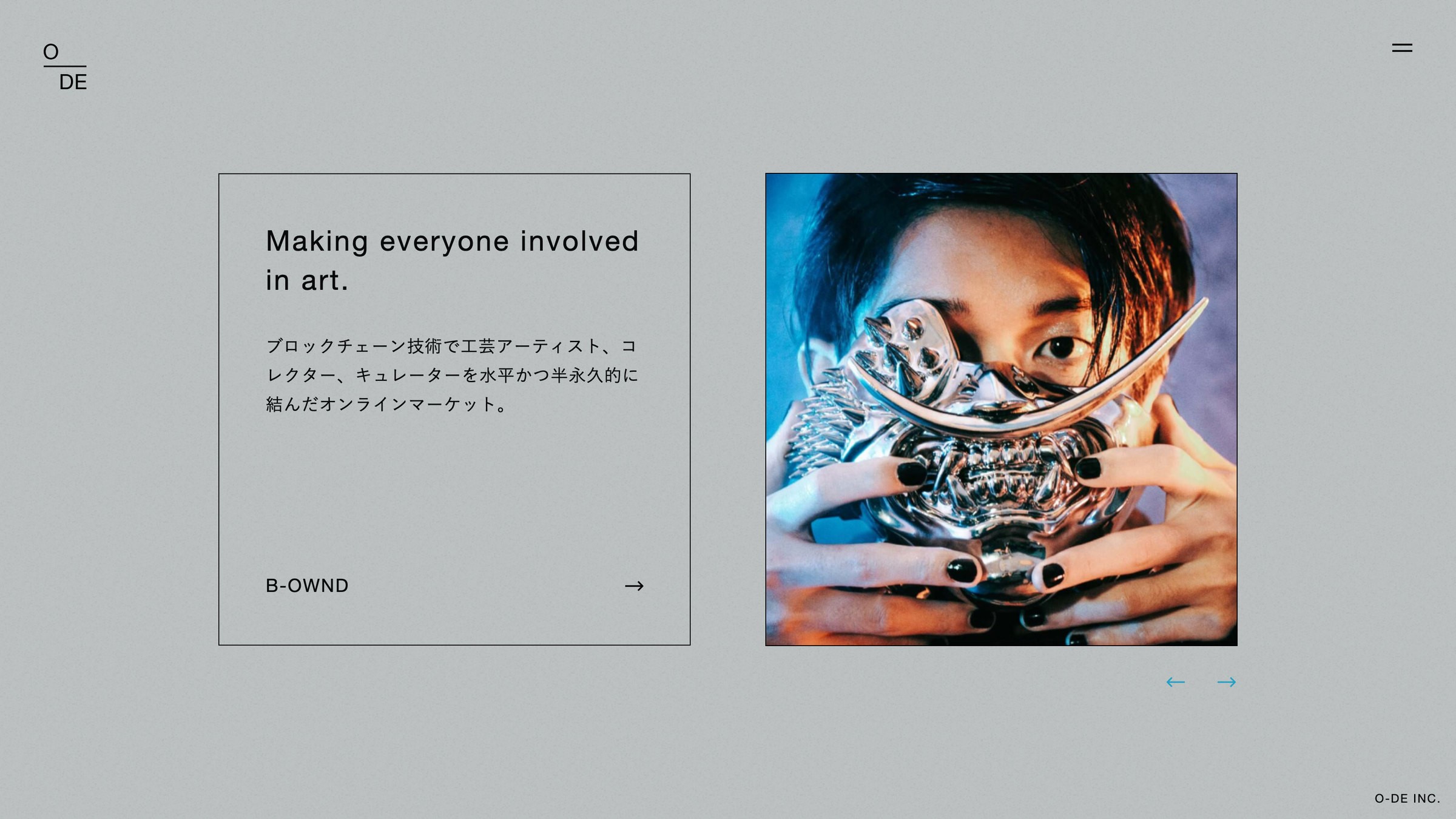
Art direction, logo and website for O-DE Inc. The structure of the name is carried by the mark itself: O and DE divided by a single rule, like a fraction. One line and the space around it hold everything, from business cards to the website, in the same quiet. The ground is an unassertive grey. By adding nothing, the breadth of the work they take on comes into view.