← Works
Taiyosunco
Taiyosunco
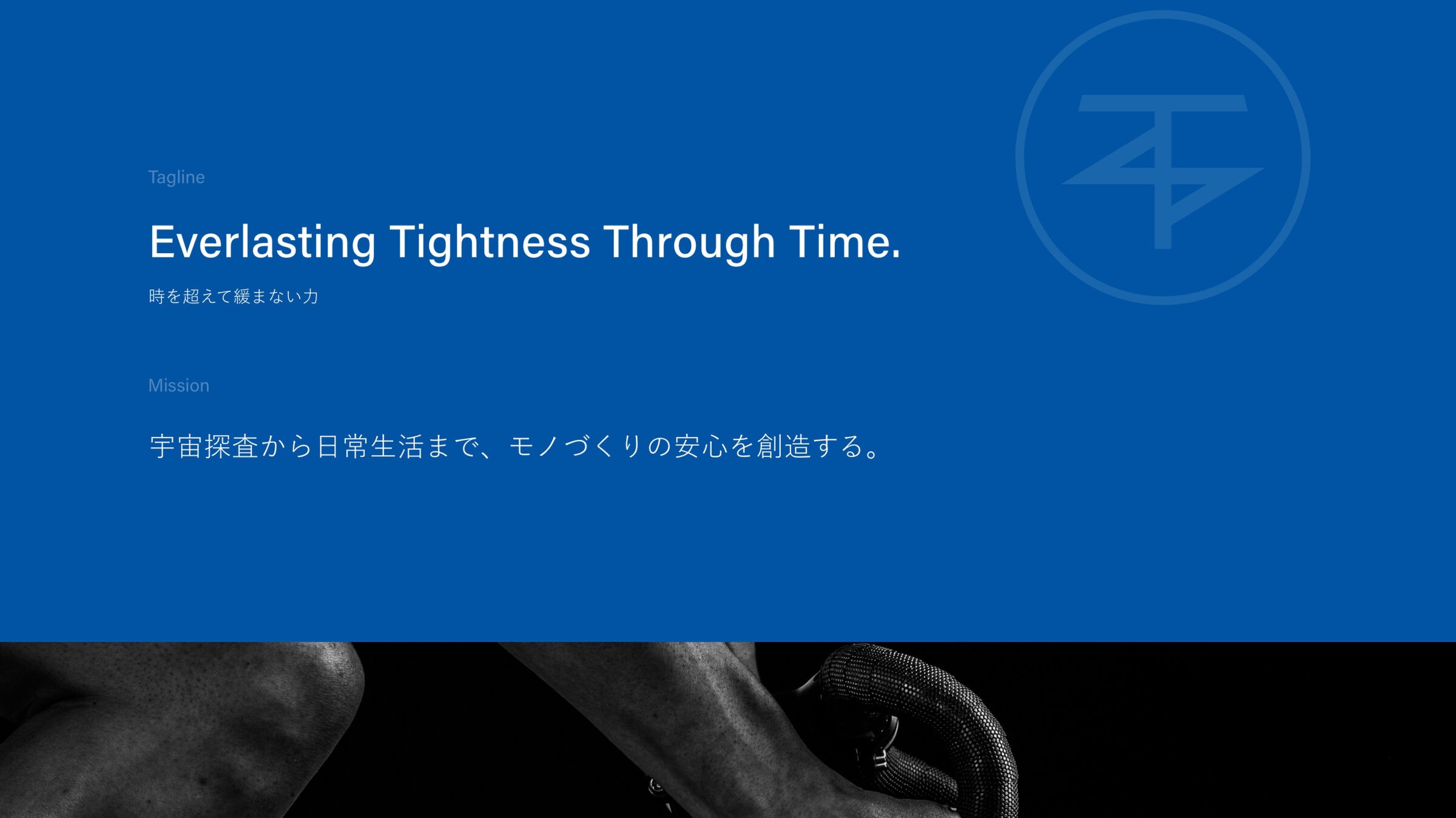
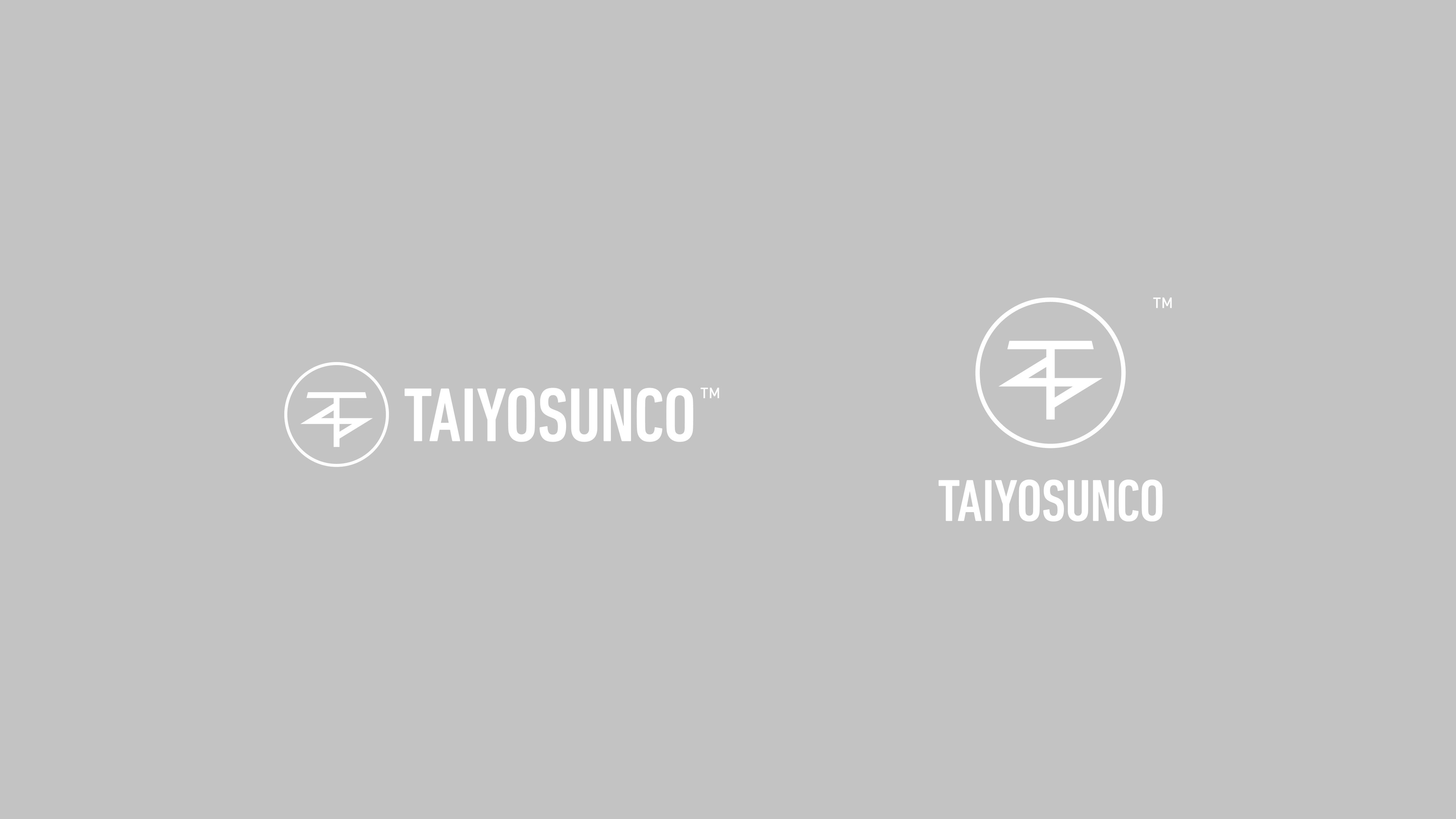
A mark in a single blue, for the technology that keeps things fastened from orbit to the home.
- Client
- Taiyosunco
- Services
- Brand Identity, Logo Design, Web Design
- Industry
- Manufacturing
- Year
- 2024
- Website
- www.taiyo-nylok.co.jp ↗
About the project
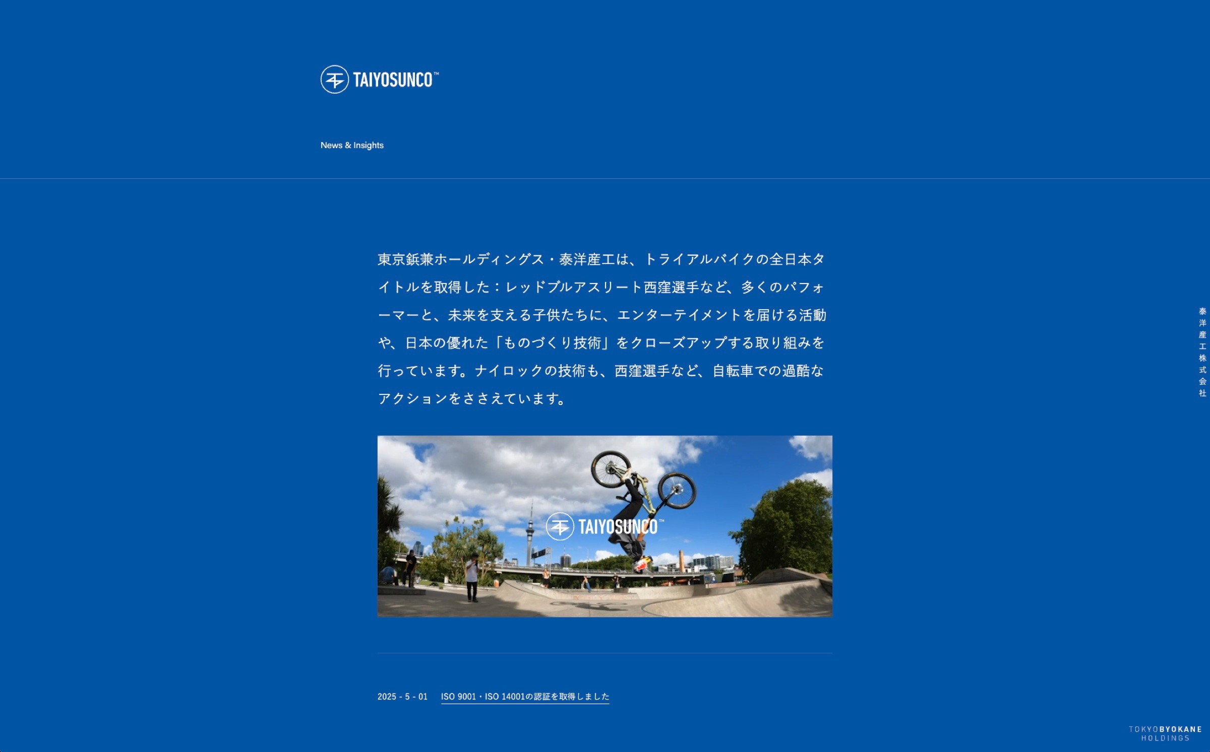
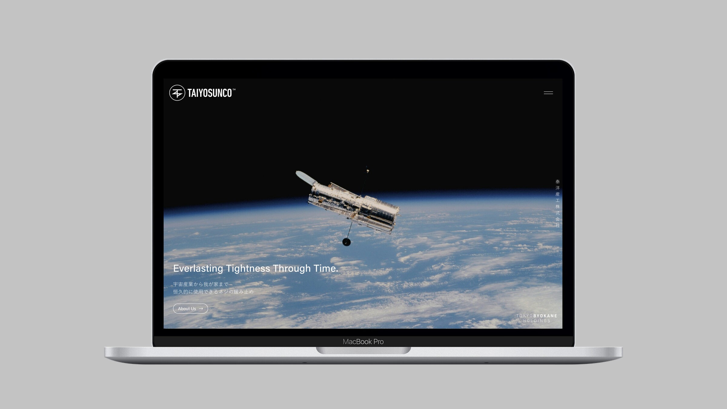
ねじの緩み止め「ナイロック」を手がける泰洋産工のリブランディングで、ロゴとウェブサイトを担当。円の中にTの横棒とジグザグの線を組んだ記号的なマークと、縦長のサンセリフの社名を、ロイヤルブルー一色で定めました。ウェブの最初の画面は宇宙望遠鏡と地球の写真に「Everlasting Tightness Through Time.」を置き、宇宙産業から暮らしまで、見えないところで支え続ける技術を、誇張せずに伝えています。